Odoo 18's website module provides an integrated solution for monitoring and analyzing e-commerce performance. The platform offers real-time insights into sales activities, customer behavior, and product performance through its comprehensive reporting system. Businesses can access these analytics directly from the website backend without requiring additional third-party tools, enabling data-driven decision-making for online store optimization.
The Odoo 18 E-Commerce Sales Process
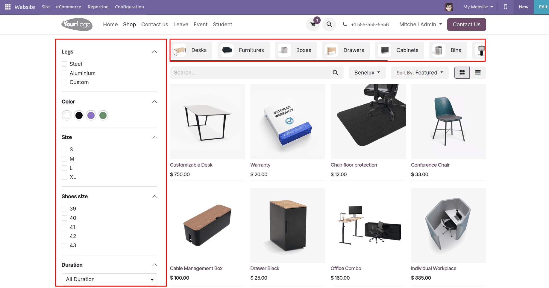
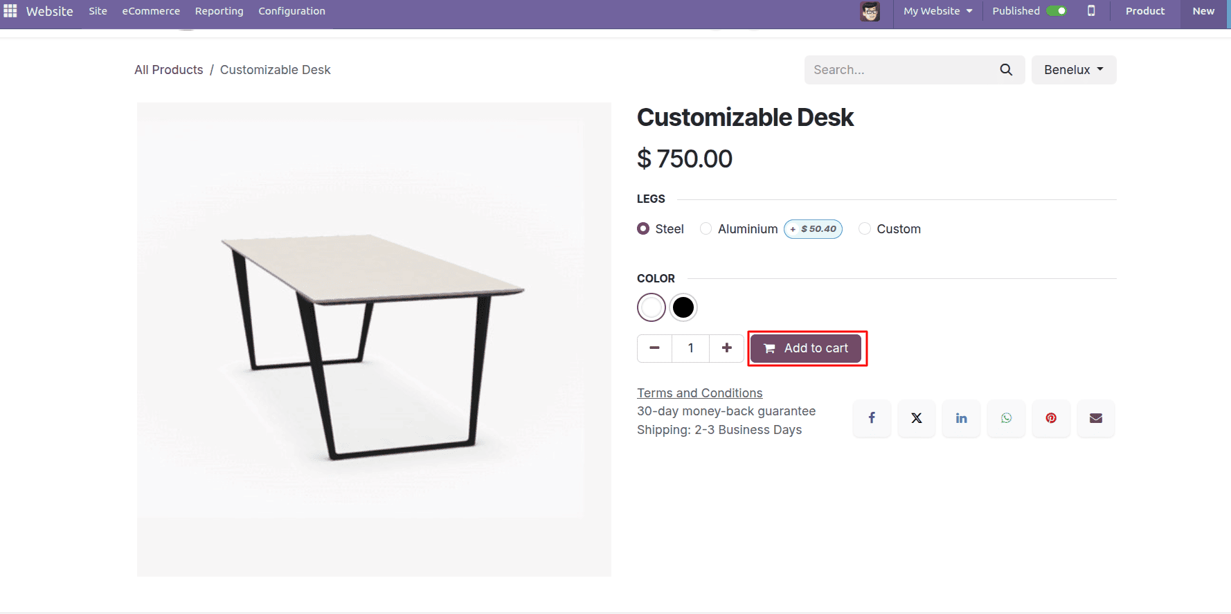
Customers can browse the product catalog, where they can filter items by category or specific attributes. Each product page displays high-quality images, detailed descriptions, customer reviews, and real-time availability - everything shoppers need to make informed decisions.
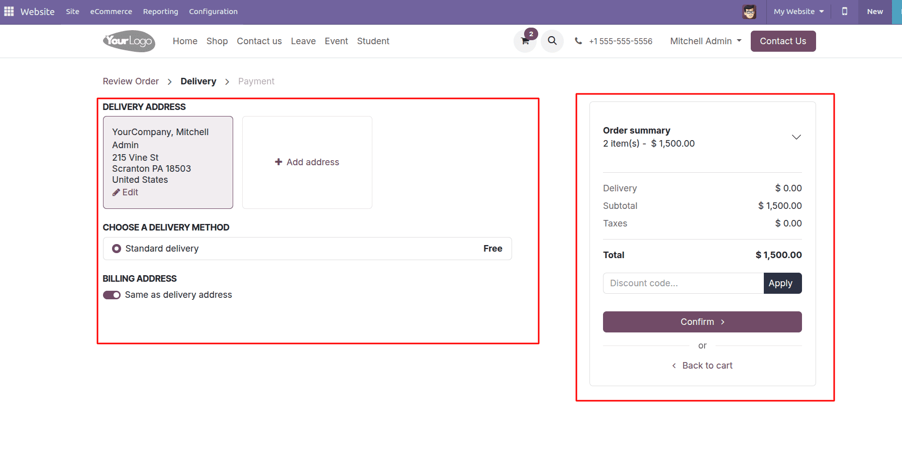
When ready to purchase, customers can simply add items to their cart and proceed through an intuitive checkout that automatically calculates taxes and shipping costs while offering multiple secure payment options.
Reporting for Online Website Sale
Website > Reporting > Online Sales
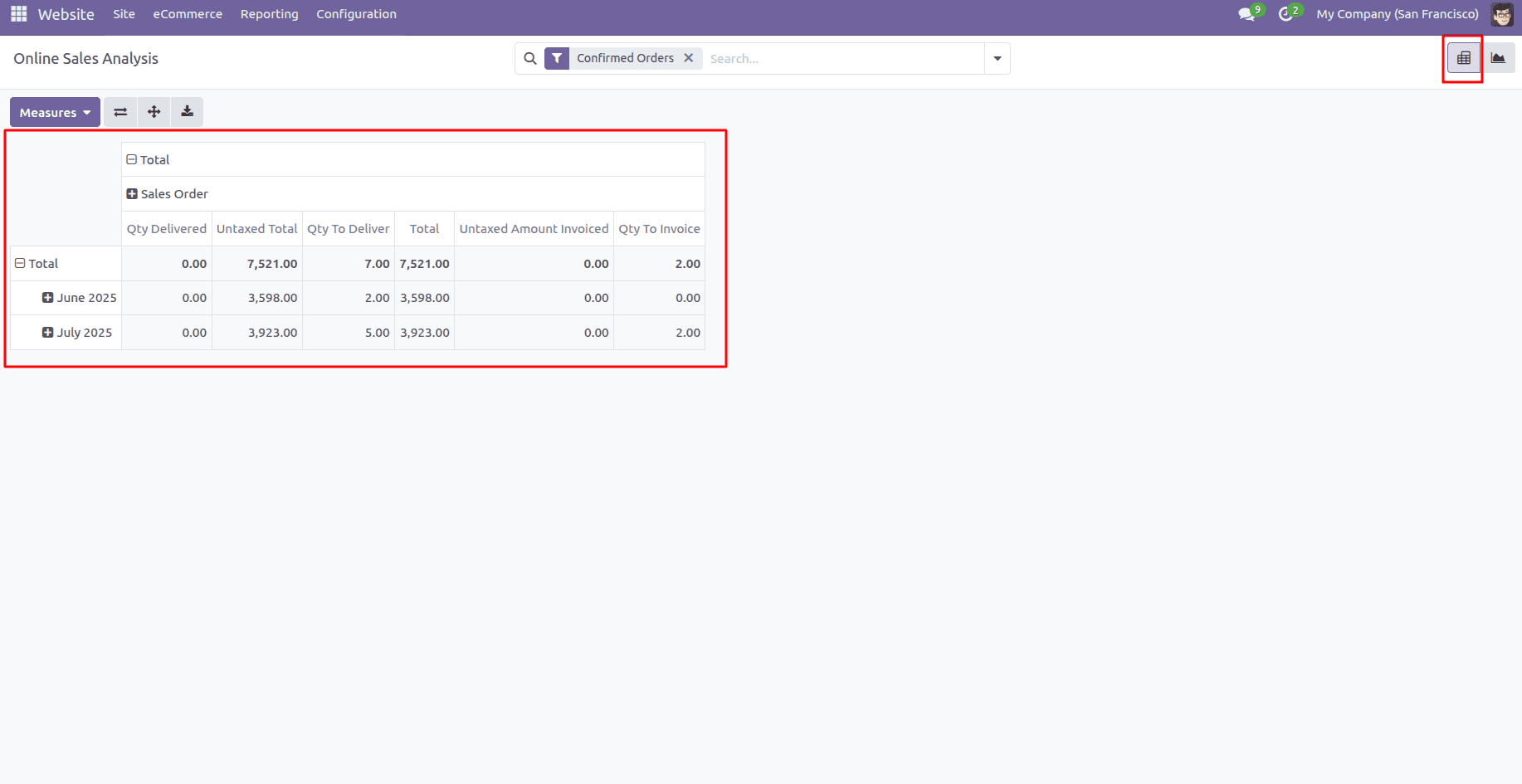
Odoo 18's website reporting dashboard offers two dynamic ways to analyze your online sales data: Pivot View and Graph View.
The Pivot View acts like an interactive spreadsheet, letting you "pivot" data by different dimensions (like date, product, or region).
The Measures tab directly powers the capabilities of pivot tables by determining which metrics are available for multidimensional analysis. When you select specific measures like total sales, untaxed amounts, or quantities ordered through this tab, you're essentially programming the pivot table's analytical engine - these chosen metrics become the building blocks that can then be organized by various dimensions (time periods, products, regions) in the pivot interface.
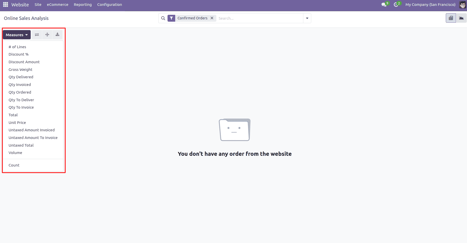
This symbiotic relationship means every measure activated becomes a potential column, row, or value in your pivot tables, transforming raw data into strategic insights. Retailers might track "units sold" against "return rates" to identify problematic products - all possible because the Measures tab feeds the pivot table exactly the customized metrics each business requires.
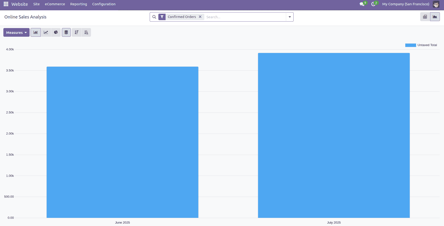
Odoo's Website reporting dashboard offers three intuitive graph views to visualize your sales data effectively.
Bar Chart
Bar chart excels at direct comparisons, using column heights to contrast metrics like monthly sales or product performance - ideal for instantly spotting your top performers.
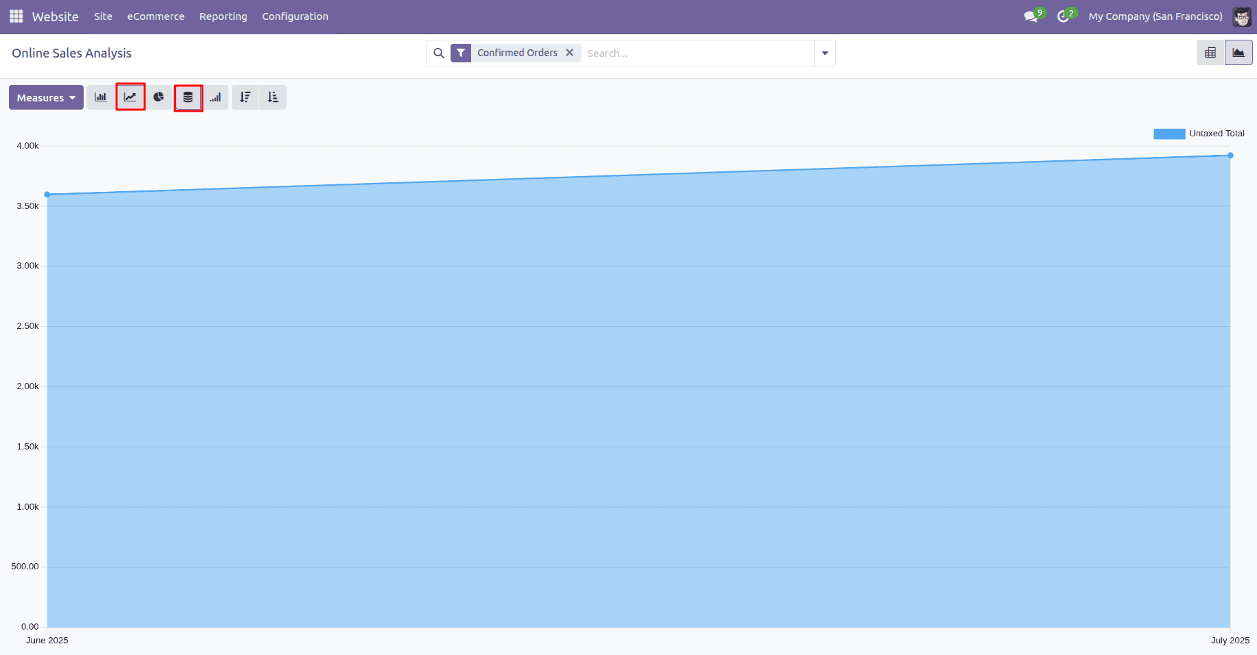
Line Chart
Line Chart connects data points over time, clearly revealing growth patterns, seasonal spikes, or concerning dips in your sales trajectory. There are two types of line charts.
1. Cumulative
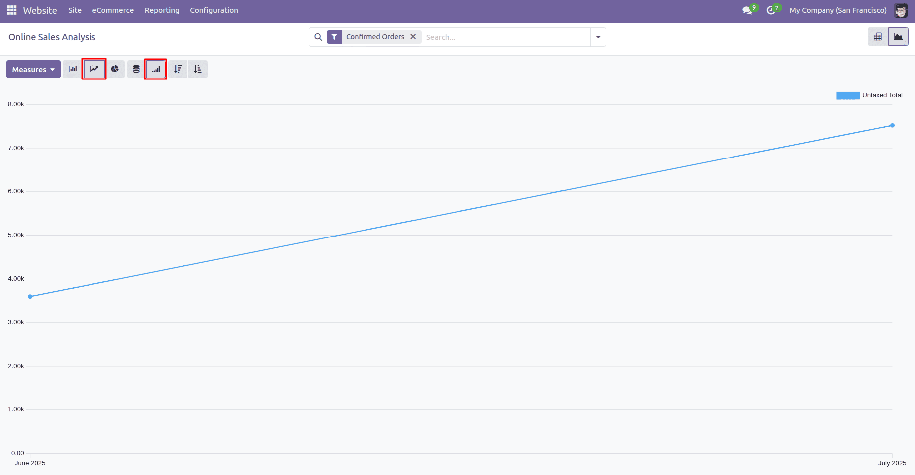
2. Stacked
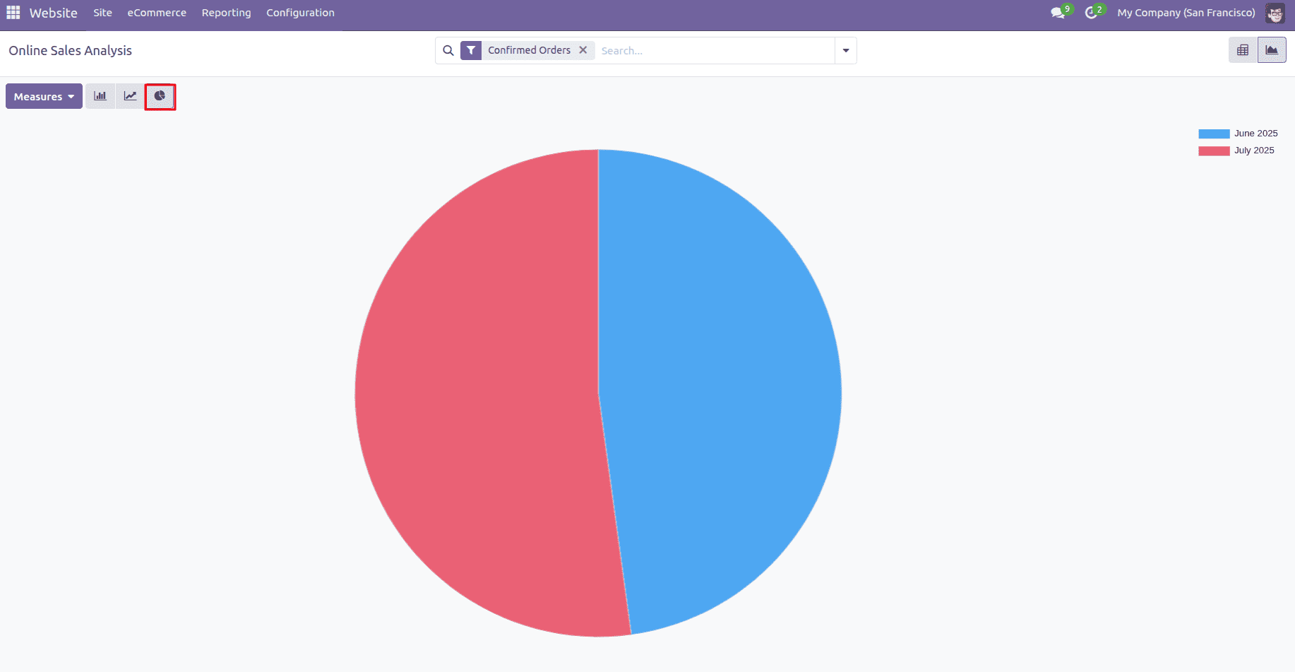
Pie Chart
Pie charts in Odoo provide a clear visual breakdown of how different categories contribute to your total sales, making it easy to identify top-performing segments at a glance. Each colorful slice represents a category's proportional share of your total sales. The larger the slice, the bigger its contribution - making it effortless to spot your top performers and underachievers at a glance.
In conclusion, Odoo's powerful sales reporting tools turn complex e-commerce data into clear, actionable insights, helping businesses make smarter decisions with confidence. The intuitive dashboard brings together essential financial metrics, visual analytics, and customizable reports, giving you a complete, real-time view of your store's performance at a glance.
To read more about How to Increasing Sales with Promotion Programs on Odoo 18 Website, refer to our blog How to Increasing Sales with Promotion Programs on Odoo 18 Website