In Odoo 19, the OWL (Odoo Web Library) framework is the basis for the front-end architecture, and one of the most customizable features in Odoo development is the ability to create your own field widget. The use of field components allows you to define exactly how the field will be presented and interacted with in Form, List, or Kanban view mode.
In this blog, we will explain how to develop custom field components in Odoo 19. It includes creating a JS (OWL) component, defining a QWeb template, registering a widget, and using the widget in view.
Why Create a Custom Field Component?
While Odoo ships with a wide range of built-in field widgets (char, many2one, badge, boolean toggle, etc.), there are business cases where none of these fit the requirement - for example:
- Display a field using custom indicators such as progress bars, color swatches, and ratings
- Include custom validation logic for your business
- Create a dynamic field that can be used as a slider or any other picker
- Combine multiple fields in a single visual field
For these situations, Odoo's field widget architecture allows you to plug in your own OWL component.
Step 1: Module Structure
Before writing any code, set up your module with the standard static asset structure:
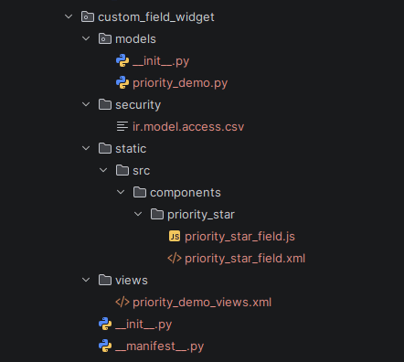
Make sure your manifest registers the assets under the web.assets_backend bundle:
Python
{
    'name': 'Custom Field Widget',
    'version': '19.0.1.0.0',
    'category': 'Extra Tools',
    'summary': 'Custom priority star field widget',
    'depends': ['web'],
    'assets': {
        'web.assets_backend': [
            'custom_field_widget/static/src/components/priority_star/priority_star_field.js',
            'custom_field_widget/static/src/components/priority_star/priority_star_field.xml',
        ],
    },
    'installable': True,
    'license': 'LGPL-3',
}
Step 2: Create the OWL Component (JS)
Fields widgets in Odoo 19 extend the Component class in OWL and are registered in the fields registry. Below is an example of a “priority star” field widget that will show click-able 1-5 stars for an integer field:
JavaScript
/** @odoo-module **/
import { registry } from "@web/core/registry";
import { standardFieldProps } from "@web/views/fields/standard_field_props";
import { Component } from "@odoo/owl";
export class PriorityStarField extends Component {
    static template = "custom_field_widget.PriorityStarField";
    static props = {
        ...standardFieldProps,
    };
    get stars() {
        return [1, 2, 3, 4, 5];
    }
    get value() {
        return this.props.record.data[this.props.name] || 0;
    }
    onStarClick(star) {
        this.props.record.update({ [this.props.name]: star });
    }
}
export const priorityStarField = {
    component: PriorityStarField,
    supportedTypes: ["integer"],
};
registry.category("fields").add("priority_star", priorityStarField);
A few things worth noting here:
- "Standard Field Props" provides all the required props that the field widget should have (e.g., record, name, readonly, etc.) and hence reduces unnecessary effort of providing them again and again.
- "This.props.record.update(...)" is the right way to update fields in Odoo 19; it uses the internal state management of records to update them.
- Supported types filter the field types which are allowed to use this widget and hence are visible on assignment in Studio or in XML code.
Step 3: Create the QWeb Template (XML)
The template defines how the component renders. Place this in the accompanying .xml file:
XML
<?xml version="1.0" encoding="UTF-8"?>
<templates xml:space="preserve">
<t t-name="custom_field_widget.PriorityStarField">
<div class="o_priority_star_field d-flex">
<t t-foreach="stars" t-as="star" t-key="star">
<i t-att-class="star <= value ? 'fa fa-star text-warning' : 'fa fa-star-o text-muted'"
t-on-click="() => this.onStarClick(star)"
style="cursor: pointer; margin-right: 4px;"/>
</t>
</div>
</t>
</templates>
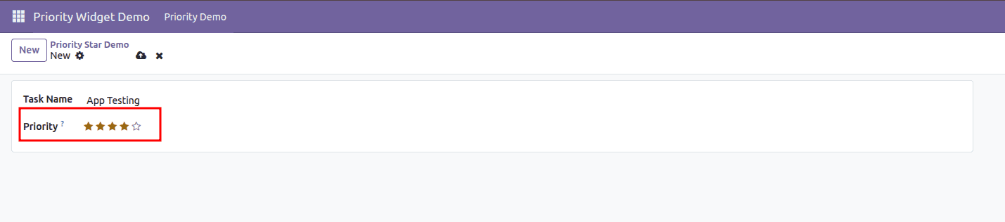
This creates five-star icons, marking the stars up to the existing rating, and allows the user to click on a star to edit the rating field.
Step 4: Use the Widget in a View
Once installed, it can be attached to any compatible field via the widget attribute:
XML
<record id="view_task_form_priority_star" model="ir.ui.view">
    <field name="name">task.form.priority.star</field>
    <field name="model">project.task</field>
    <field name="inherit_id" ref="project.view_task_form2"/>
    <field name="arch" type="xml">
        <xpath expr="//field[@name='priority']" position="attributes">
            <attribute name="widget">priority_star</attribute>
        </xpath>
    </field>
</record>
The priority star field widget is rendered in the Odoo 19 form view.
Key Points to Remember
- Always include the standardFieldProps in order for your widget to work with the standard field API (readonly state, invalid state, etc.).
- Use record.update() and avoid directly manipulating data in order for the widget to remain consistent with the ORM layer and dirty state tracking.
- Make sure to register your widget with the appropriate supportedTypes in order for it to be provided only where it makes sense.
- Make sure to place the JavaScript and XML files in the same directory and include them in the manifest's assets.
Creation of customized field components in Odoo 19 is a process that you can undertake by utilizing a trusted methodology where you create your own OWL component and bind it with your QWeb templates. In addition, you register this component in the fields registry and assign the same in your field using the 'widget' attribute in your views. Your data is completely controlled in how it should be viewed and how it should be entered by you.
To read more about How Create a new field component in Odoo 18, refer to our blog How Create a new field component in Odoo 18.