The frontend of the Point of Sale in Odoo 19 is powered by OWL. Thus, through efficient programming, users can add their own OWL components, which can help them in adding custom functionalities to the POS screens. One important issue related to customizing the POS system is adding a new button to perform a certain task. The button may open a window, show some notifications, or trigger a process regarding a current order.
Let us take a look at the creation of a simple widget for the Odoo 19 POS. The widget will add a button to the POS product screen. When the cashier pushes the button, they will see a notification with information about the customer, the number of order lines, and the sum of the current order.
The given example indicates how JavaScript components, XML templates, POS assets, and template inheritance come together.
What is a Widget in POS?
In Odoo 19, various OWL components construct the entire POS interface. Every single component is assigned to show the part of the POS screen and ensure the correct execution of user actions. A custom widget, in essence, refers to a component created to meet our specific needs.
In this case, the widget itself will include a JavaScript class that has the necessary logic and an XML template that describes the button the user sees. JavaScript will provide the means to access the current order and show the pop-up, while XML construction will create the button whose clicking will be linked to the necessary JavaScript function.
Module Structure
pos_custom_widget/
+-- __init__.py
+-- __manifest__.py
+-- static/
    +-- src/
        +-- js/
            +-- custom_widget/
                +-- custom_widget.js
                +-- custom_widget.xml
                +-- custom_widget.scss
                +-- control_buttons_inherit.xml
The logic of the widget will be located in custom_widget.js. The template of the widget will be in custom_widget.xml. The control_buttons_inherit.xml file will help us add the widget to existing POS control buttons. The custom_widget.scss file is optional and is used for styling purposes.
Step 1: Define the Manifest
Next, we need to define the module manifest.
The manifest tells Odoo which module is being created, which modules it depends on, and which frontend assets should be loaded.
# -*- coding: utf-8 -*-
{
    'name': 'POS Custom Widget',
    'version': '19.0.1.0.0',
    'category': 'Sales/Point of Sale',
    'summary': 'Adds a custom OWL widget (button + popup) to the POS product screen.',
    'author': 'Cybrosys',
    'depends': ['point_of_sale'],
    'assets': {
        'point_of_sale._assets_pos': [
            'pos_custom_widget/static/src/js/custom_widget/custom_widget.js',
            'pos_custom_widget/static/src/js/custom_widget/custom_widget.xml',
            'pos_custom_widget/static/src/js/custom_widget/custom_widget.scss',
            'pos_custom_widget/static/src/js/custom_widget/control_buttons_inherit.xml',
        ],
    },
    'installable': True,
    'license': 'LGPL-3',
}
The point_of_sale module is required for the implementation of the customization in the POS.
Assets are added to point_of_sale._assets_pos. This is important as the files will have to be loaded by the POS frontend. If not included in the right asset bundle, the code written in JavaScript and XML will not be available when the POS is being opened.
Step 2: Create the Widget JavaScript
Now, let’s proceed with the JavaScript section of our widget creation. Let’s create a file custom_widget.js in the custom_widget folder.
/** @odoo-module **/
import { Component } from "@odoo/owl";
import { _t } from "@web/core/l10n/translation";
import { useService } from "@web/core/utils/hooks";
import { usePos } from "@point_of_sale/app/hooks/pos_hook";
import { ControlButtons } from "@point_of_sale/app/screens/product_screen/control_buttons/control_buttons";
import { AlertDialog } from "@web/core/confirmation_dialog/confirmation_dialog";
import { patch } from "@web/core/utils/patch";
export class CustomWidgetButton extends Component {
    static template = "pos_custom_widget.CustomWidgetButton";
    static props = {};
    setup() {
        this.pos = usePos();
        this.dialog = useService("dialog");
        this.notification = useService("notification");
    }
    get currentOrder() {
        return this.pos.getOrder();
    }
    getOrderSummary() {
        const order = this.currentOrder;
        if (!order || order.isEmpty()) {
            return _t("The current order is empty.");
        }
        const lines = order.getOrderlines();
        const partner = order.getPartner();
        const total = this.env.utils.formatCurrency(order.totalDue);
        return _t(
            "Customer: %(customer)s\nLines: %(count)s\nTotal: %(total)s",
            {
                customer: partner ? partner.name : _t("None"),
                count: lines.length,
                total: total,
            }
        );
    }
    onClick() {
        const order = this.currentOrder;
        if (!order || order.isEmpty()) {
            this.notification.add(_t("Add a product before using the custom widget."), {
                type: "warning",
            });
            return;
        }
        this.dialog.add(AlertDialog, {
            title: _t("Custom Widget"),
            body: this.getOrderSummary(),
        });
    }
}
// Register our widget as a child of the built-in ControlButtons component.
patch(ControlButtons, {
    components: { ...ControlButtons.components, CustomWidgetButton },
});
Now, examine the key components of the code. An OWL component is created using the Component class.
export class CustomWidgetButton extends Component {
    static template = "pos_custom_widget.CustomWidgetButton";
}
The template value declares which XML template is assigned to the component. We will create this template in the next section.
Accessing the POS
Inside the setup() method, we use usePos() to access the POS.
setup() {
    this.pos = usePos();
    this.dialog = useService("dialog");
    this.notification = useService("notification");
}
The function usePos() enables the retrieval of the POS state. Here, it is utilized in fetching the current order. The opening of the pop-up is done through the dialog service, whereas the notification service works in showing the warning message.
Getting the Current Order
The following getter returns the current order:
get currentOrder() {
    return this.pos.getOrder();
}
Once the order is available, we can get its lines and the customer.
const lines = order.getOrderlines();
const partner = order.getPartner();
The total amount is obtained from order.totalDue.
const total = this.env.utils.formatCurrency(order.totalDue);
Here, using formatCurrency() is useful because the amount will be displayed according to the currency configured for the POS.
Handling the Button Click
The onClick() method is called when the cashier clicks the custom button.
onClick() {
    const order = this.currentOrder;
    if (!order || order.isEmpty()) {
        this.notification.add(_t("Add a product before using the custom widget."), {
            type: "warning",
        });
        return;
    }
    this.dialog.add(AlertDialog, {
        title: _t("Custom Widget"),
        body: this.getOrderSummary(),
    });
}
The code starts by checking if there is an order and the presence of items in it. If the order is void, then a warning message is displayed. If items are present, an AlertDialog is shown, and the order summary is given to it. The _t() function is used to translate the message accordingly.
Registering the Widget
There is one more important part in the JavaScript file:
patch(ControlButtons, {
    components: { ...ControlButtons.components, CustomWidgetButton },
});
The ControlButtons component is already implemented within Odoo POS. So our widget component should first be added with this component before it can be used in the template. The existing components are first cloned with the use of the spread operator, and then we can add our CustomWidgetButton.
This helps us retain the existing components of POS while adding our own.
Step 3: Create the Widget Template
The JavaScript file contains the logic, but we still need to define what the button looks like.
Create custom_widget.xml with the following code:
<?xml version="1.0" encoding="UTF-8"?>
<templates id="template" xml:space="preserve">
    <t t-name="pos_custom_widget.CustomWidgetButton">
        <button class="btn btn-secondary btn-lg lh-lg custom-widget-btn" t-on-click="onClick">
            <i class="fa fa-magic me-1" role="img" aria-label="Custom Widget" title="Custom Widget"/>
            <span>Custom Widget</span>
        </button>
    </t>
</templates>
The t-name must correspond to the name given in the js component. In JavaScript code, we give
static template = "pos_custom_widget.CustomWidgetButton";
So it is used in the XML template. Also, the button possesses:
t-on-click="onClick"
Thus, clicking the button corresponds to the call of the onClick() method of the JavaScript class. We use Font Awesome class for the icon. The icon can be replaced with another one depending on the custom functionality needs.
Step 4: Add the Widget to the POS Screen
By this point, we have created and registered the component, but you must add it to the POS interface. For this instance, we will insert the button within the Action menu on the POS product page.
Create control_buttons_inherit.xml:
<?xml version="1.0" encoding="UTF-8"?>
<templates id="template" xml:space="preserve">
    <t t-name="pos_custom_widget.ControlButtons"
       t-inherit="point_of_sale.ControlButtons"
       t-inherit-mode="extension">
        <xpath expr="//div[hasclass('control-buttons-modal')]" position="inside">
            <CustomWidgetButton/>
        </xpath>
    </t>
</templates>
Here, t-inherit is used to extend the existing Odoo POS template.
t-inherit="point_of_sale.ControlButtons"
The t-inherit-mode="extension" means that we are adding our changes to the existing template instead of replacing it. The XPath expression finds the control buttons container:
<xpath expr="//div[hasclass('control-buttons-modal')]" position="inside">Then, the custom component is inserted into that container <CustomWidgetButton/>. This is what makes the button appear in the POS interface. We are not modifying the original Odoo source file. The change is kept inside our custom module through template inheritance.
Step 5: Add Some Styling
The widget already works without any custom styling, but we can add a small amount of SCSS to adjust the button.
Create custom_widget.scss:
.custom-widget-btn {
    display: flex;
    align-items: center;
    justify-content: center;
    .fa-magic {
        color: $primary;
    }
}
This centers the contents of the button and uses the primary color for the icon.
More styles can be added here if the button needs a different appearance.
How the Custom Widget Works
It is necessary to go through the entire process of how the module functions from its installation. Once the POS interface is opened, Odoo loads the JavaScript and XML files from the point_of_sale._assets_pos asset.
Using the JavaScript file, the CustomWidgetButton is created, and then thereafter the ControlButtons component is modified in order for the CustomWidgetButton to be featured. The XML template uses the ControlButtons template while placing the new button within the More menu feature.
As soon as the cashier clicks on the button,
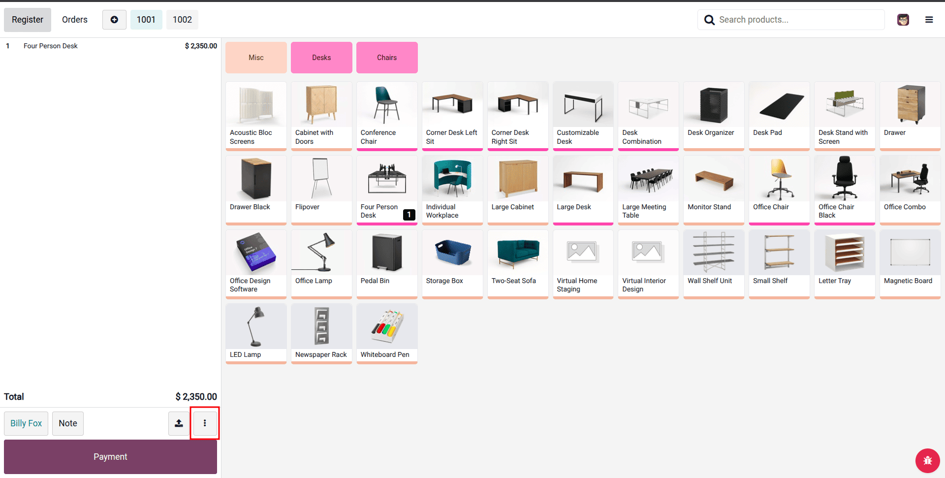
The method is called onClick().
In the case of no products being present in the current order, a warning message is shown.
If there are products available, the widget gets information regarding the customer, order lines, and total amount, which will then be displayed in the AlertDialog.
This is a simplified explanation of the operation of many other POS customizations in the version Odoo 19. Since the connection between the OWL component, XML template, and the existing POS component is established, the same approach can be used for other needs as well.
To build a custom widget in Odoo 19 POS, the first step involves developing an OWL component and linking it to the POS application. In this instance, the custom button created is registered as part of ControlButtons and integrated into the More menu, and the button presents current order details in the pop-up window.
In the same way, many other developments can be created in this particular POS, including new buttons, popups, notifications about made orders, new product information, and so on. Moreover, since the customization exists in a separate module, giving an opportunity for easier maintenance, at the same time, it extends the original Odoo POS templates rather than altering them as is done in many other cases.
To read more about How to Create a Widget in Odoo 18, refer to our blog How to Create a Widget in Odoo 18.